How many different devices do you envision your web site being displayed on? Traditionally sites were designed to display properly on a large monitor attached to a desktop computer. With the widespread adoption of laptop computers some compromises had to be taken into consideration when laying out our pages. The challenges presented then are much less daunting than what faces the owner of a website today.
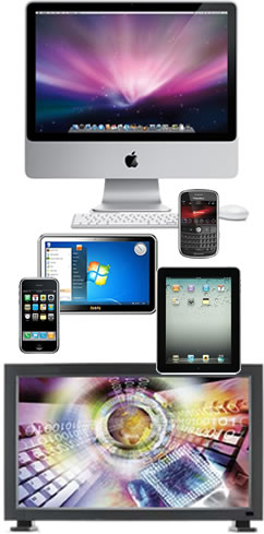
Consider some of the machines that now access the internet. A partial list includes:
- desktop computers
- laptop computers
- tablets (iPad)
- smartphones (iPhone, Android)
- gaming consoles (XBox, Playstation)
On top of this, some of these devices switch from portrait to landscape view depending upon how the users orient them.
The challenge of creating consistent web pages in the face of these obstacles was taken up by a number of pioneering designers, such as Andy Clarke and Ethan Marcotte. Ethan gives a brief introduction to the concept of Responsive Web Design in an article published on the website A List Apart. In brief, responsive web pages adjust their presentations to suit the devises they are being viewed on. Take a minute to think about that. Page layout for a viewer using a laptop differs from the layout presented to a smartphone user, which, in turn, differs from what a tablet users sees. These adjustments are made instantly, without any actions taken by the visitors to your site.
How is this accomplished? The magic lies in something called media queries. If you have an interest in digging deeper into the code behind it all, I suggest starting with Ethan Marcotte's article. For those of you who have businesses to run or organizations to support, you can leave the details to a designer who has adopted the techniques required to make your site responsive. Ask your present web designer if your site is taking advantage of Responsive Web Design in order to correctly present your information on the wide variety of devices that are now accessing the Internet.